Header Redesign
My Role
Lead Product Designer
– Feature Scoping
– Interface Design
– Prototyping
– Interaction Design
Team
Riveshu Trivedi, PM
Chandan Mishra, FED
Deepak Gupta, FED
Timeline
September 2023 – November 2023
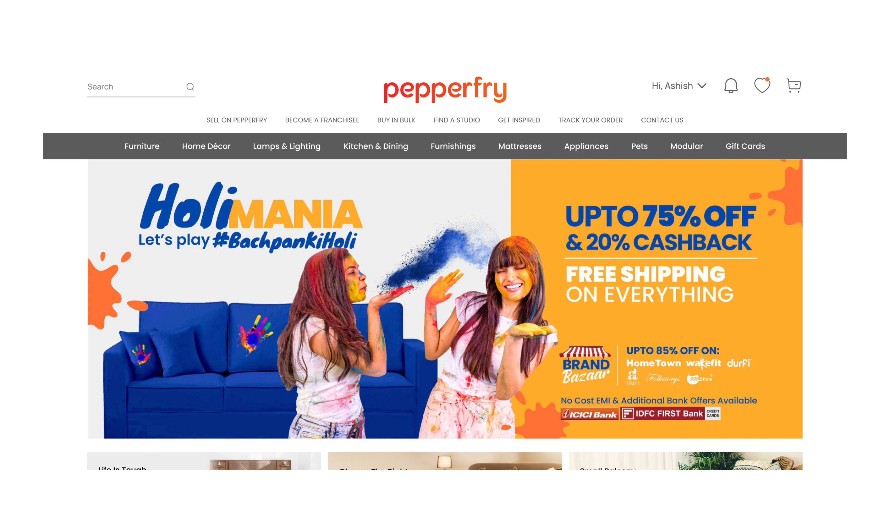
BEFORE BEFORE BEFORE BEFORE BEFORE BEFORE BEFORE BEFORE BEFORE BEFORE
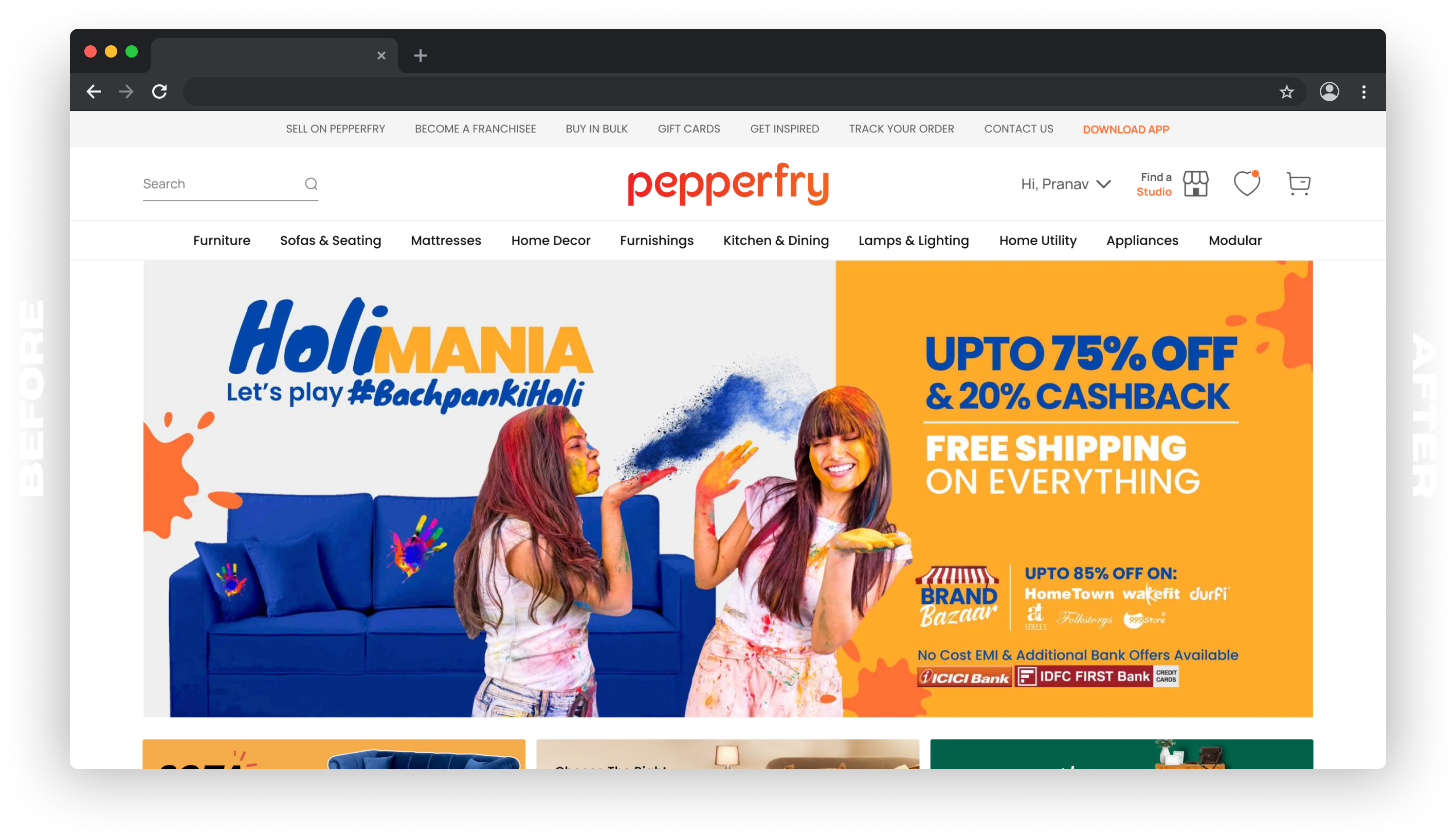
AFTER AFTER AFTER AFTER AFTER AFTER AFTER AFTER AFTER AFTER AFTER AFTER

[Drag Slider to Reveal Before / After]


CONTEXT CONTEXT CONTEXT CONTEXT CONTEXT CONTEXT CONTEXT CONTEXT CONTEXT CONTEXT
The website header is a critical component, serving as the user’s initial point of interaction upon landing on any page offering a range of options to guide users in determining their next steps. Key header elements, such as Metas, Hover, Search bar, Cart, Wish list, Studios, Top Nav, Contact Us, and other secondary CTAs, serve as the primary means of navigation for users to explore the website, allowing them to align their actions with their intentions.
CONTEXT CONTEXT CONTEXT CONTEXT CONTEXT CONTEXT CONTEXT CONTEXT CONTEXT CONTEXT
The
Objective
The older header layout on Pepperfry’s website, while functional, had some areas of improvement as it used to present a certain degree of clutter, imbalance and lacked a clear, structured arrangement. This can potentially overwhelm users making navigation less intuitive. The proposed changes are aimed at addressing these challenges and achieving a visually balanced and aesthetically pleasing appearance. This involved adjustments in spacing, colour-weight balance for a harmonious UI along with addition of interactions with certain elements of the header.
WHAT CHANGED?

↓
↓
↓
[Hover Over Elements to Interact]
- Notification Icon Replaced
- The notification bell icon was an underused feature that occupied prime real estate on the header without delivering value to the user, as no actual notifications were sent. This space has now been repurposed for a ‘Find a Store’ CTA, encouraging users to visit physical locations. This change not only declutters the interface but also aligns with the business goal of increasing in-store interactions.
- Download App CTA
- Previously, the header lacked a direct prompt for users to engage with the brand beyond the website, missing out on a key touchpoint in the customer journey. The inclusion of a ‘DOWNLOAD APP’ button serves as a clear, visible CTA that promotes the company’s mobile application, likely leading to increased app engagement and a seamless omnichannel experience for the user.
- Utility Navigation Revamp
- In the old layout, the utility navigation (Sell on Pepperfry, Buy in Bulk,…etc) was positioned just above the primary navigation menu, causing a visual amalgamation of links and options. This could potentially overwhelm users and detract from a clean and structured interface. By relocating it to the top of the header, the design now benefits from a clear separation of concerns. This elevation of utility links declutters the space around the primary navigation, resulting in a more organized and hierarchically structured interface. It facilitates quicker visual scanning and allows users to distinguish between general information and specific category navigation with greater ease.
- Primary Navigation Revamp
- The primary navigation’s grey background with white text presented a strong contrast that, while clear, may have dominated the header a bit too aggressively. This could inadvertently overshadow other important elements and create a visual hierarchy that was perhaps too pronounced. The redesign embraces a more subdued approach, with a white background and black text for the primary navigation. This shift not only harmonizes with contemporary design sensibilities that favor minimalism and clean lines, but it also ensures that the primary navigation complements rather than competes with the rest of the header elements.
- Aesthetic Restructuring
- The original design followed a standard e-commerce layout but didn’t leverage aesthetics to guide user behavior or highlight key actions. The new aesthetic approach not only modernizes the visual appeal of the header but also employs strategic use of color, contrast, and space to draw attention to important elements, enhancing the overall visual hierarchy.
- Interaction Design
- In the old layout, interaction cues were subtle and inconsistent, potentially causing user hesitancy in clicking or exploring. Redesign brought in improved interaction design elements such as expanding search bar on hover, hover effects, and active state indicators make the navigation experience more engaging and informative, likely reducing bounce rates and increasing user retention.

